Accenture: A leading global professional services company specializing in digital, cloud, and security solutions, serving clients in over 120 countries.
OTIP: Ontario Teachers Insurance Plan (OTIP) is a not-for-profit organization that provides insurance and group benefits specifically for education employees in Ontario.
About the app
About the application
The Ontario Teachers Insurance Plan (OTIP) member app is designed to give users a seamless way to manage their insurance policies online. The experience supports key member actions such as viewing coverage details, updating personal information, receiving important notifications, and accessing support quickly. Whether members have home, auto, or multiple policies, the app helps them stay organized and informed while encouraging upgrades and additional coverage through strategically placed upsell opportunities.
Built with both desktop and mobile users in mind, the application prioritizes accessibility, clarity, and ease of use. It was developed in close collaboration with cross-functional teams to ensure a consistent experience across platforms, align with Salesforce capabilities, and support business goals like reducing support calls and increasing policy engagement. Every element was designed with the user in mind, helping members feel confident and in control of their insurance from anywhere.
In 1994, the movie Speed came out, featuring Keanu Reeves as a cop trying to stop a bus that would explode if its speed dropped below 50 mph. That was the design equivalent of what myself and two other product designers faced when we joined the Ontario Teachers Insurance Plan (OTIP) project. Our mandate was to redesign OTIP's authenticated member experience and create a new mobile app. We were brought in at Phase 5 of the project and handed a 225-page deck expected to begin wireframing within our first week.
To provide more context: in Phase 1, Accenture had created a few splash pages and a minimal design system with 4-5 components and typography guidelines after winning the bid. However, during Phases 2-4, no designers were involved.
The client hadn't seen any designs in two years of working with Accenture, so they were very antsy and anxious. In the first week when a functional lead presented a Saleforce page to show some early functionality, one of the clients aggressively questions them for 10 minutes asking why this is relevant, where is the design, and more. As we were catching up on the 225 page deck given to us by the functional team, I spoke to my director notifying her that we need a sitemap or user journey before we create any wireframes. Otherwise, we would be designing without direction. She rescheduled the first design presentation by a few days, and in the meantime I created a sitemap to present to the client and notified them I would be updating this as the project evolved over the next few months.
The next step was creating and presenting the home page wireframe. This was a high stakes moment since no designs had been shown in years. Before the presentation, a functional project manager from Accenture insisted that the functional team should present all the work, as they owned the requirements and stories. My director and I pushed back, noting designers should present their work because we can effectively articulate our rationale and the design process. We reached a compromise with functional kicking off presentations, then design would walk through the visuals, and functional would return to cover the requirements.
Early on, I reached out to client leadership to request access to a test account for their current platform, allowing me to analyze usability pain points and strengths before jumping into design.
I presented the home page, incorporating key features that ensured users without home or auto insurance still saw prominent upsell opportunities encouraging them to add coverage. This followed the deck the team had worked on before where their key pillars were focused at boosting upselling, cross-selling, and reducing member support calls. A week later, I also presented mid-fi designs of the home page, taking feedback from the client on top of creating 70+ different colour variations to find the right tone and visuals for the entire app.
As the workload scaled up, my primary focus areas became:
Home page
Unauthenticated pages
Notifications
Link coverage
Account Settings
Our process involved hosting live workshops with the client, frequently updating designs in Figma during the sessions to reflect their input in real time. The Account Settings section alone changed seven or eight times due to new client requests and Salesforce limitations that surfaced only after designs were complete, requiring us to pivot regularly.
Initially, we created wireframes and low-fi designs internally before transferring them to the external Figma file shared with the client. But once we hit the mid- and high-fidelity phases, we worked almost exclusively in the shared file.
Although mobile-first design is a best practice, we were initially directed by leadership to focus solely on desktop designs. Despite advocating for parallel design tracks, we had to create mobile versions several weeks after desktop designs had already been approved.
About three months in, one teammate rolled off the project. A junior designer joined about two months into the project and took on mobile design and prototyping responsibilities for both desktop and mobile experiences. To support his onboarding, I created some of the initial mobile designs as templates he could reference, helping set a strong foundation for consistency and quality. I mentored him throughout, providing detailed feedback on his designs and offering guidance on both visual design details and soft skills such as stakeholder communication, note-taking, cross-functional collaboration, among other things.
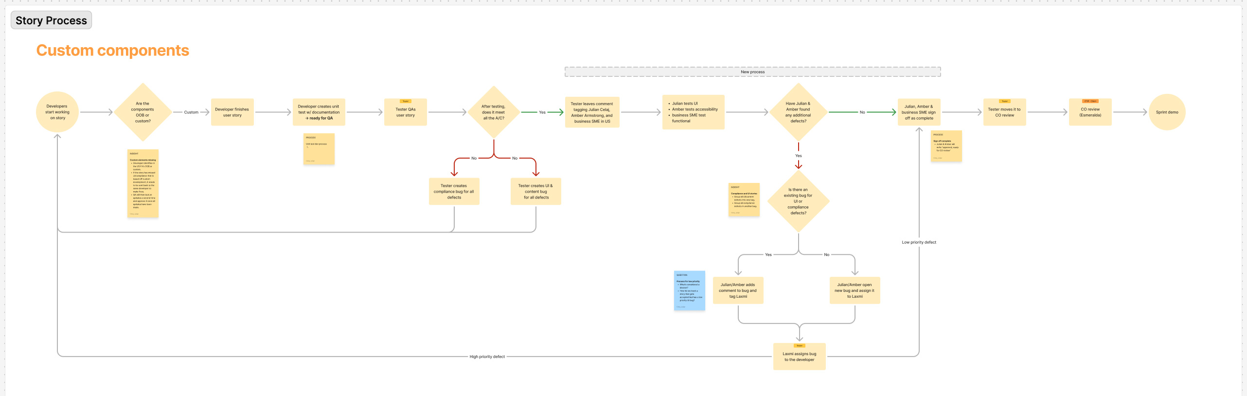
Writing stories & enhancing processes
As high-fidelity designs were finalized, four separate engineering pods began development. The fast pace concerned me, as it increased the risk of miscommunication, mistakes, and rework. I had several conversations with the accessibility lead, who was flagging stories that did not meet accessibility standards, even though they had been marked complete in Azure DevOps (ADO). To address this, I began writing UI bug stories in ADO with the goal of catching and correcting issues before they were closed. I followed the accessibility lead's standards to ensure each story was clear and aligned with developer expectations.
During sprints, I reviewed every story in detail and documented any missing design or functional context in a Word document. I shared these notes in our team chat with the functional leads, who then made the necessary updates before the developers began their work. Although this type of review was outside my original scope, I took it on because the fast-moving nature of the project made alignment and accuracy critical.
As additional gaps emerged, I proposed a new review flow: no story would be marked complete until it was reviewed by both compliance and design. I mapped out this process and presented it to project leadership, who approved the change. I also began joining daily standups for all four developer pods to serve as a consistent point of contact for design and functional questions. This reduced blockers and helped the engineering teams stay on track.
I designed a targeted cross-sell section on the home page specifically for users with group benefits but no home or auto insurance (biggest use case). This component was placed prominently in the experience to drive attention and encourage users to expand their coverage. It aligned with OTIP's strategic goal of increasing policy adoption through contextual, needs-based prompts.
Reduce support calls
We simplified the navigation structure and surfaced clearer paths to insurance plan details, making it easier for users to explore, compare, and enroll in different policies. This information architecture overhaul, combined with clearer in-context guidance, aimed to reduce member confusion and ultimately lower the volume of support calls.
Accessibility (WCAG compliance)
To broaden access and align with WCAG standards, we embedded accessibility best practices across our design system and screen-level UI decisions. This included proper contrast ratios, keyboard navigation support, semantic structure, and accessible form behaviors to support users with diverse needs.
Responsive design
We transformed OTIP's desktop experience to be fully responsive across modern screen sizes and developed a dedicated mobile app to ensure consistency, usability, and access on the go. This shift significantly improved the member experience, allowing users to manage their insurance easily across devices.
Moving forward
We rolled off this project as the four development teams were finishing their QA to finalize everything, but there's a few things I would love to do in the future:
Usability testing: Conduct usability tests to validate key flows, uncover pain points, and align the experience more closely with user needs.
Add plans seamlessly: Due to Salesforce limitations and certain deals with 3rd parties, when users click to add some insurance plans, they're taken to another website. The experience would be smoother if the user can add every plan within the app.
Unauthenticated UI: Outside of a few pages on the unauthenticated platform, the rest of the pages still use the old UI. It's a better and more seamless experience for a user to go through the same UI that follows one design system.

